In the world of logo design, typography plays a crucial role in conveying a brand’s message and personality. Choosing the right fonts and arranging them creatively can make a logo stand out and leave a lasting impression on the audience. This blog post explores the power of typography in logo design in 2023 and provides answers to frequently asked questions regarding this fascinating aspect of branding.
Why is Typography Important in Logo Design?
Typography is vital in logo design because it helps communicate the brand’s essence and values. Different fonts evoke different emotions and associations, allowing designers to create logos that align with the brand’s personality. Typography also aids in readability, ensuring that the logo can be easily recognized and understood by the target audience.

How Does Typography Contribute to Brand Identity?
Typography in logo design contributes to brand identity by establishing a visual identity that is unique and memorable. The right choice of fonts can create a sense of professionalism, playfulness, elegance, or any other desired trait, reflecting the brand’s character and attracting the intended audience. Consistency in typography across various brand elements fosters brand recognition and reinforces the brand’s image.
What Factors Should Be Considered When Choosing Fonts for a Logo?
When selecting fonts for a logo, several factors should be considered:
- Brand Personality: The fonts should align with the brand’s personality and values.
- Legibility: The chosen fonts should be easily readable, even in different sizes or formats.
- Uniqueness: Using distinctive fonts helps the logo stand out from competitors.
- Scalability: Fonts that scale well across different mediums ensure logo versatility.
- Timelessness: Opting for timeless fonts ensures that the logo remains relevant for years to come.
Should a Logo Use Custom Typography or Pre-existing Fonts?
The decision to use custom typography or pre-existing fonts depends on various factors, including budget, brand identity, and uniqueness. Custom typography allows for a unique and tailored design that perfectly embodies the brand. However, it can be time-consuming and costly. Pre-existing fonts, on the other hand, provide a wide range of options and can be more cost-effective. Ultimately, the choice should be based on the brand’s specific needs and goals.
How Can Typography Enhance the Message in a Logo?
Typography has the power to enhance the message conveyed by a logo. It can visually emphasize certain words or elements, creating hierarchy and guiding the viewer’s attention. The right combination of fonts can evoke emotions and associations that reinforce the intended message. Additionally, typography can be used creatively to incorporate subtle symbolism or hidden meanings within the logo design.
Trends that you have to follow in 2023:
Big And Bold
This typeface will not disappoint. It does not need to be announced because it is obvious at first glance. Anything that brings the positive must be accompanied by a small warning: despite its size and ability to capture the viewer’s attention, we must be careful not to overburden the visual or logo with visual noise.
If you want to utilize a large, strong font, be sure it has contrast. Simply contrast the use of a large font with a smaller subtitle or slogan.
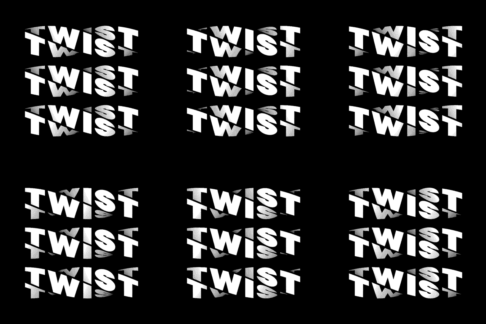
Warped And Funky
Experiment with your typographies! These typefaces add a whimsical touch to your brand without employing the Comic Sans MS font. These receive the previously mentioned movement. Many distorted and funky fonts have a ’70s vibe; trends come and go!
In the same spirit as the huge font, be sure to give contrast and not overdo your logo or graphic so that there isn’t too much visual noise.
Geometric Sans Serif
This is a classic. Geometric sans serif typeface is a must-have. These typefaces provide your brand a professional and visually beautiful appearance, implying that “they are experts.” It isn’t necessary to draw attention to it since its simplicity inspires faith. It serves a purpose and adds balance and structure to your logo.
You may even organize it as a subtitle or motto by using a large font or a warped and wacky font—anything to create balance and functionality.
Sophisticated
The serif font continues to be useful and ageless, which is why it retains its popularity year after year. Finding the right one might be difficult because there are so many wonderful options. A typeface sans serif as a subtitle or tagline might be a perfect complement if utilized as the typography of your logo. This combination has the ideal blend of refinement and professionalism, elegance and toughness.
It is hard to overburden a picture with this typeface. Allow for blank spaces to allow the eye to breathe while reading. When selecting a serif font, make sure you have several styles so you can experiment!
Flexible Font
The latest of all trends. Although this style is often expensive, and the target audience ranges from 15 to 35 years old, it remains a must in many industries such as fashion, beauty, candles, and more. It’s a style to think about since it adds movement and a desire to explore with its illustrative and adaptable appearance.
If you wish to utilize this font style for your logo, consider a geometric sans serif font for the phrase or subtitle. This will provide the necessary structure and balance.
Conclusion:
Typography plays a significant role in logo design, shaping brand identity, and conveying messages effectively. The careful selection of fonts and their creative arrangement can make a logo memorable, recognizable, and impactful. By considering factors such as brand personality, legibility, uniqueness, scalability, and timelessness, designers can create logos that truly represent and resonate with the brand. Whether choosing custom typography or pre-existing fonts, the power of typography in logo design cannot be underestimated.
It’s vital to note that before you locate the correct font to reflect your company’s image, you’ll need to do multiple experiments. This is how we recognize logos like Google, Apple, and Uber. Take advantage of this time to consider your target demographic and the tone of your company.


