Brochure designs have long been used to sell your services. In many circumstances, they are the first introduction a potential client will have to your brand. Both printed and digital brochures have progressed over the last decade in terms of style, patterns, and so on. Each year, new trends develop, affecting designer’s tastes time after time. Stay ahead of the game by incorporating these 10 brochure design trends for 2023 into your marketing materials.
Unfold with Style
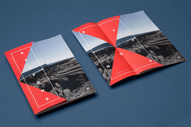
Two-fold and tri-fold brochure designs have been popular for quite some time. However, there is always room for creativity in terms of style. Make your brochure design fold angular and give the viewer a sneak peek to make your design stand out. For a distinctive and elegant appearance, choose the die-cut brochure design with cut-out panels and forms.
Allow Typography to Take Control
Many brochure design providers are now creating brochures with “no image,” and this trend is gaining traction. The use of typography to its greatest potential is the new chic. For a more visual and understandable effect, use a bigger font or create pauses between letters in each syllable. Alternatively, use varied angles, alignments, and colors to make the letters aesthetically interesting and stand out from the other aspects of your design. You might get ideas from some of the brochure designs.
Utilize Line Art to your Advantage
Line art is defined as the use of clean, strong lines against a background to create a strikingly detailed contrast. Line art has been popular for some time and continues to be popular. Designers clearly do not want their designs to appear out of place. Get it?
To generate visual contrast from your text, use line art on one panel. Use the folds in your brochure design to your advantage. To add interest and originality, try applying line art across panels to deliver a message that is split up between folds. Line art is often geometrical and, when used correctly, may make your brochure appear appealing.
Stand Out with 3D Graphic Elements
Make an impression! No, we mean literally. In comparison to 2D brochure designs, 3D graphic components are an astonishing new trend. Make components of your brochure design stand out by including 3D images that pop out when the brochure is opened. It is a unique and modern presentation of your company since it raises specific components for the reader to notice.
Go Soft with Muted Colors
Although some online brochure designers prefer gentler colors, vibrant colors are not entirely out of the question. Muted colors are used by designers because they are easy on the eyes of the audience and provide a sense of comfort for the reader. Organic businesses employ earthy colors to create a more natural and serene appearance.
If your brand’s personality is quirky and loud, let those bold colors reflect that. Vibrant colors, when used correctly, provide the powerful pop that certain brochure designs require to make a statement. You may also use brilliant color gradients in your brochure design to highlight specific sections.
Be Trendy with Illustrations
Images do not have to be included in your brochure. Create graphics for your panels and arrange them in linear order for visual impact and relatability. Get creative; make up characters or people, or narrate a tale.
Set the Tone with Neutral Photos
The images you use in your design define the atmosphere and tone of your brochure. Select neutral stock photographs that appear to be from an everyday routine. The objective of stock pictures is that they may be used in a variety of situations. Photos with neutral tones and faces are popular, and they give a familiar touch to your design, allowing your audience to feel comfortable with your brand.
Create an Impact with Accents
Too much information may put off your potential consumer. Give them a break by placing accents as a design element on the pages between folds of your brochure design so that they can digest information one at a time.
Accents may enhance the appeal of your typeface. Use letter cut-outs to build a word on the front panel, with an eye-catching image connected to the words on the second panel, to offer the audience a sneak peek within your brochure.
Focus on your Materials
Concentrate on your supplies for producing the brochure design. Using recycled paper not only gives your brochure a rusty and earthy feel but also helps your company appear ecologically conscious.
Subtle tweaks may improve the feel of your brochure. Curved edges on your brochure design might make your audience feel warmer and cozier than crisp edges.
Remember the Color Model
Pro tip: If you’re going to build your own brochure using an online brochure maker tool, make sure to do it in CMYK rather than RGB. The RGB color option is ideal for digital designs, whereas CMYK is intended for printing. When you design in CMYK, your printed design will look just like it does on your screen.
Isometric Graphics
Designers have begun to utilize isometric images in moving or static forms in response to the misuse of basic visuals. These visuals help to add dimension to the design elements. This art transforms ordinarily flat things into 3D objects.
Conclusion:
Brochure design ideas for 2023 include a broad range of typefaces, brilliant colors, avoiding grids, geometrical forms, animated vintage, colorful fonts, and so on. Incorporating these brochure design trends into your marketing strategy will help you create captivating and memorable brochures that effectively communicate your brand’s message. Stay on top of the latest design trends and make your brochures stand out in 2023.
If you need a brochure designed quickly and at a low cost, SEOInsighterX is the place to go. Our designers handle daily design requests for a variety of graphic design demands from varied clients and provide them within 24 to 48 hours. We also provide a 14-day money-back guarantee, so there is no risk. Check out our subscription options here. Create an impactful brochure with SEOInsighterX that stands out from the competition!


